
Élan

This project is a visual identity for a fictional ballet studio, a branding exercise exploring how the language of movement can shape the look and feel of an institution dedicated to classical dance. From typography to color to mark-making, every design decision was guided by the discipline, elegance, and historical depth that define ballet as an art form.
MOODBOARD

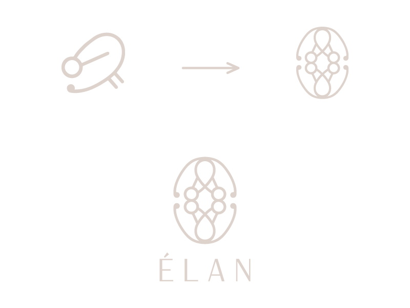
LOGO CONCEPT
Rooted in the origins of classical ballet, the logo draws inspiration from Beauchamp–Feuillet notation, a 17th-century system developed to record the intricate steps, floor patterns, and movements of dancers in the French royal court. This notation, created by Pierre Beauchamp and published by Raoul-Auger Feuillet, was a groundbreaking tool that allowed choreography to be precisely documented, taught, and preserved across generations.


For this project, I focused on a single fragment of the notation, translating its delicate, geometric lines into a modern, refined symbol. The result is a sleek, high-end logo that honors centuries of ballet tradition while embodying a contemporary, upscale aesthetic where the elegance of historical movement meets minimalist modern design.

COLOR PALETTE

E2D7D0 — “Théâtre Blush” evokes the delicacy of powdered skin tones, satin pointe shoes, and the warm glow of stage lights just before a performance. It brings an air of grace, softness, and tradition to the identity.
492630 — “Velvet Bordeaux” introduces warmth and richness, inspired by historic velvet curtains, aged theater interiors, and the opulence of classical stage costumes. It adds emotional depth and a sense of heritage.
101211 — “Obsidian Stage” grounds the palette with strength and intensity, referencing shadow, structure, and the dramatic depth of the stage itself. The space where control, tension, and movement come to life.
Together, these colors create a refined balance between light and darkness, fragility and control, echoing the dual nature of ballet itself while supporting a high-end, timeless, and emotionally rich visual identity. The color palette was developed to reflect the emotional depth, discipline, and quiet luxury of classical ballet. Each shade draws from both the physical environment of the theater and the poetic contrast between softness and strength that defines the art form.
TYPOGRAPHY
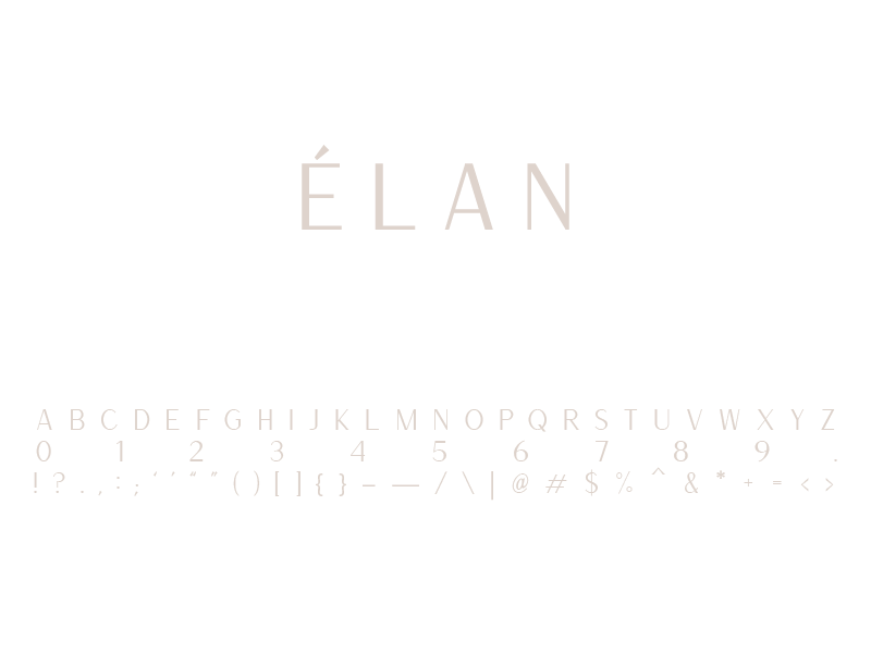
Versailles was selected as the primary typeface for its refined, timeless sans-serif presence. Modern and minimal, yet carrying the subtle sophistication typically attributed to serif fonts. With clean, smooth lines, balanced strokes, and a hint of contrast, Versailles delivers clarity and elegance without traditional ornamentation.
In this context, the font bridges contemporary minimalism and classical refinement, echoing the clean geometry of ballet notation while staying rooted in a modern, upscale aesthetic. As such, it strengthens the identity’s blend of historical inspiration and present-day crispness: polished, legible, and quietly luxurious.
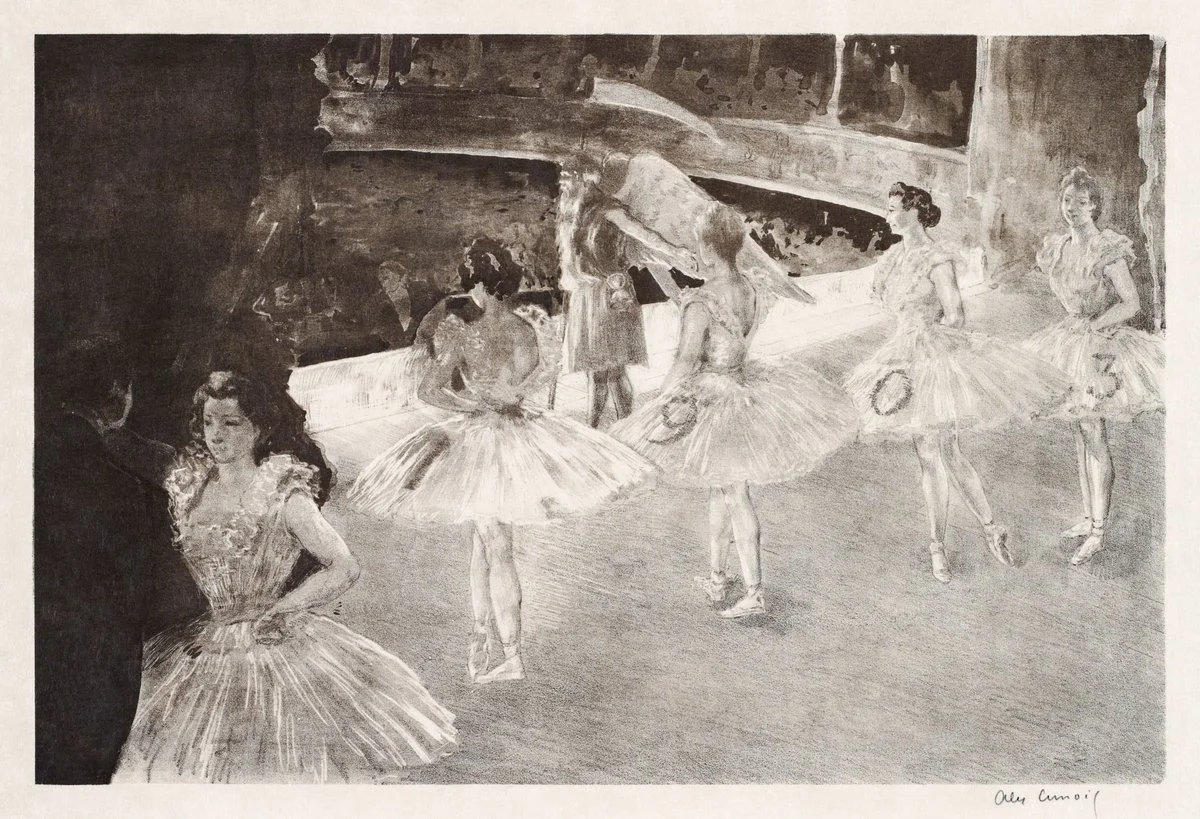


Set against darkness, the tickets reveal classical type and aged paper textures. The composition evokes anticipation, structure, and the restrained atmosphere before the curtain rises.
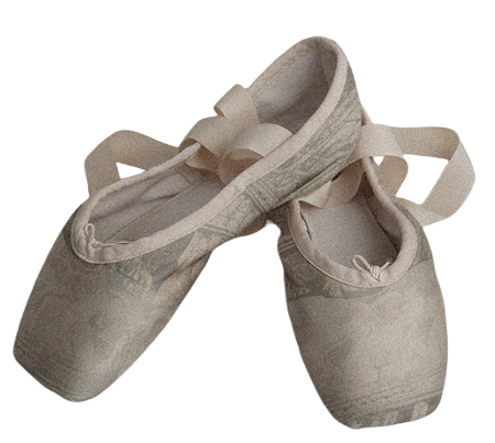
Softened by time and movement, the shoes carry the marks of daily practice. Muted tones and worn textures reflect discipline, repetition, and the quiet intimacy of preparation.
