đurđa marković

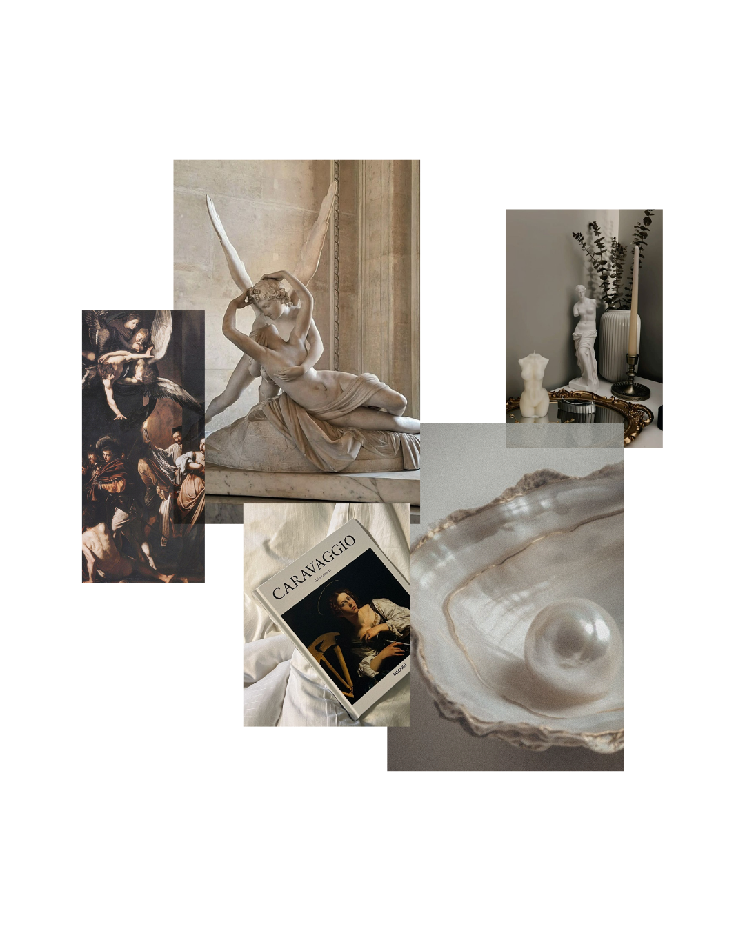
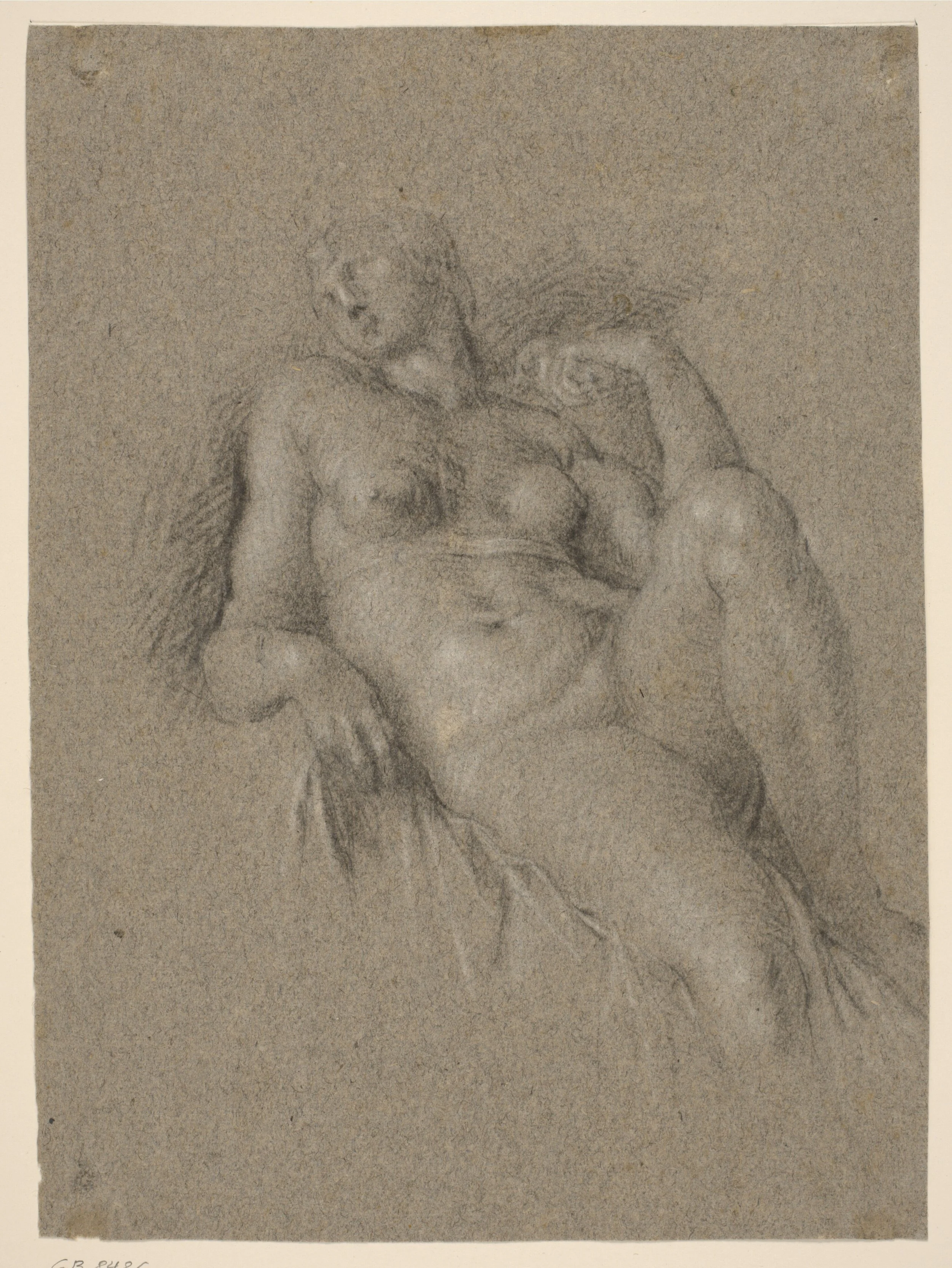
My personal brand identity is rooted in my love for art history. I’ve always been drawn to how classical forms, from Renaissance sculpture to Baroque light and shadow, carry a sense of permanence and quiet power. With this identity, I wanted to create something that reflects that passion: a system that feels thoughtful, timeless, and refined, while still being clean and modern enough to live in today’s design world.
This brand is not just a visual identity, but an extension of how I see design: as a dialogue between the past and the present, where history inspires innovation.
MOODBOARD
LOGO CONCEPT
The foundation of this identity is the idea of balance. Taking inspiration from classical forms while expressing them through a modern design system. Instead of directly imitating historical aesthetics, I focused on translating their essence into clean, functional elements: a pared-down monogram, a thoughtful typographic pairing, and a color palette that creates a sense of lightness and clarity.
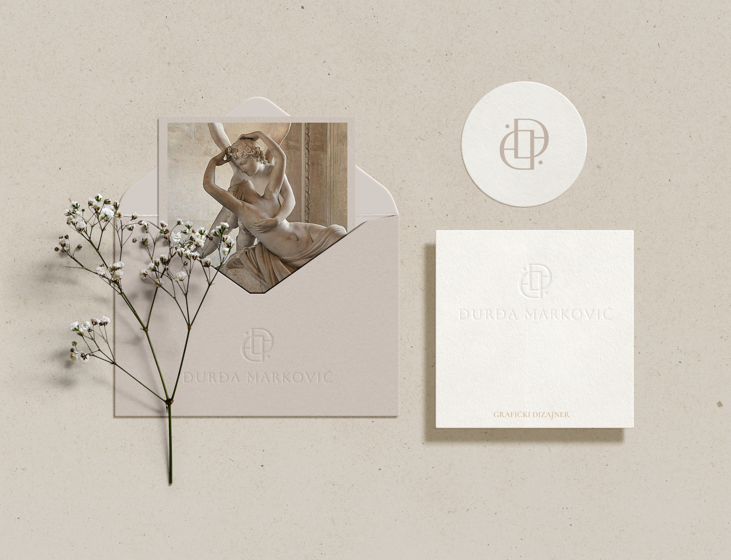
The goal was to create a brand language that feels refined and professional, but also flexible enough to adapt across platforms. Whether applied to print materials, digital interfaces, or subtle lifestyle contexts, the system maintains a consistent voice: structured and quietly distinctive. This approach ensures the brand feels timeless and professional, while remaining adaptable across digital and print environments.
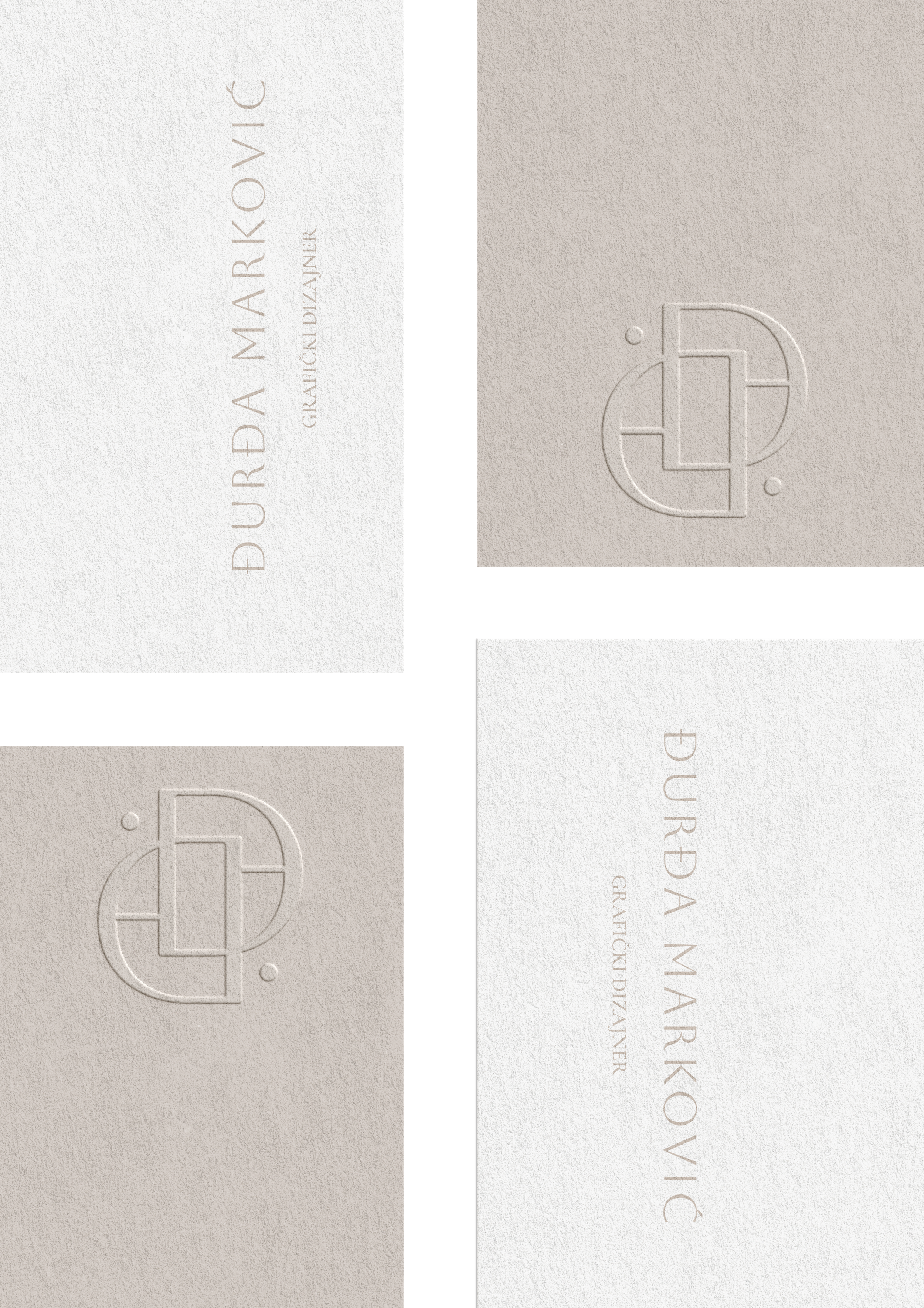
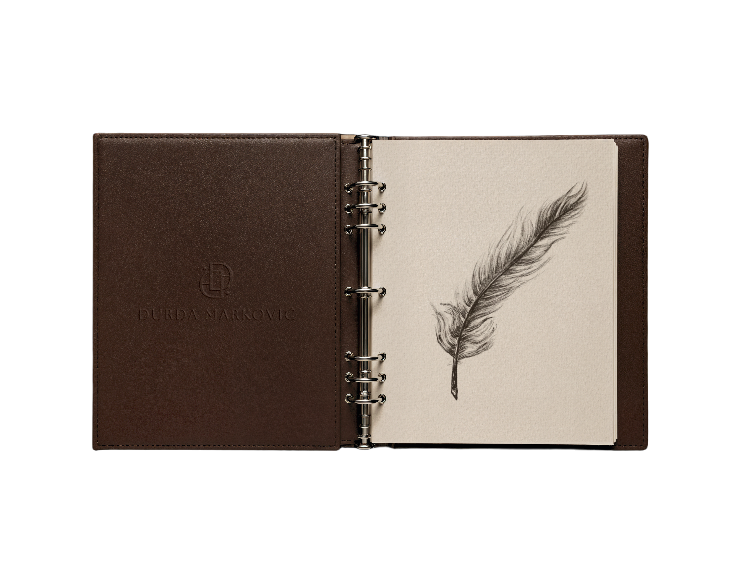
The logo is built from two Ð characters, forming a monogram that serves as a distinct personal mark. It is abstract enough to feel modern while remaining recognizable and adaptable. The simplicity of the form makes it work across different applications, from digital icons to print details like embossing or watermarks.

COLOR PALETTE

The palette is deliberately minimal and airy, drawing inspiration from the brightness of marble sculptures, the softness of antique linen, and the dramatic depth of chiaroscuro contrasts. These references work together to create a restrained yet expressive visual system.
The result is a palette that feels refined, balanced, and quiet in tone, allowing space for clarity and focus. Rather than competing with the design work, it supports it, creating contrast where needed and softness where appropriate, so the content remains the central focus.
TYPOGRAPHY
Typography sits at the core of this identity, functioning as both a practical system and an expressive reflection of my design values.
Display Typeface: Aboreto — inspired by the Renaissance majuscule alphabet of Luca della Robbia, reinterpreted rather than directly replicated. It carries a strong historical presence while being adapted for contemporary digital use, giving the identity a distinctive and expressive voice.
Body Typeface: Cormorant Garamond — elegant, refined, and highly readable, built on classical proportions with subtle detailing that supports long-form text, presentations, and case studies. It brings balance and clarity without losing its historical depth.
Together, Aboreto and Cormorant Garamond form a cohesive typographic system — expressive where attention is needed, restrained where clarity is essential. This pairing reflects a design philosophy rooted in historical structure, executed with precision, and adapted for modern application.