NENAD BAKAJIN

Nenad Bakajin Photography is a wedding photography studio rooted in cinematic storytelling and emotional narration. The rebrand was commissioned to reposition the studio within a high-end, minimalist, and editorial space, moving away from conventional wedding aesthetics toward a more timeless, film-informed, and narratively rich visual language. The goal was not to decorate the brand, but to frame photography as art and authorship.
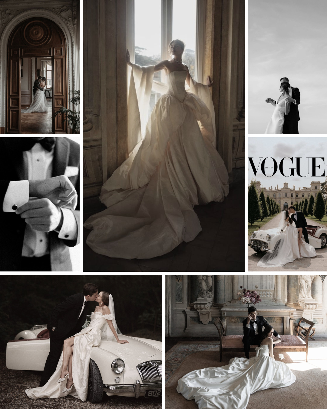
MOODBOARD
challenge
The wedding photography market is visually saturated with romantic tropes, ornate typography, and trend-driven aesthetics. While emotionally expressive, these conventions often age quickly and fail to reflect photographers whose work prioritizes mood, narrative, and cinematic control. The challenge was to craft a brand identity for wedding photography that evokes luxury without tipping into excess, while emphasizing craft and heritage over fleeting trends. It needed to maintain integrity across both dark, dramatic visuals and light, editorial compositions, positioning the work closer to the realms of film and fine art than traditional event documentation

LOGO CONCEPT
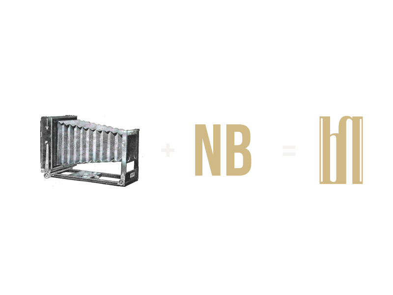
The identity is built around the idea of photography as a crafted instrument rather than a fleeting moment. At its core lies a highly stylized monogram that merges the photographer’s initials N and B into a single architectural form. This structure subtly references early folding plate cameras, evoking an era when photography required patience, precision, and intention. Instead of depicting a camera directly, the monogram abstracts its logic: verticality suggests structure and framing, repetition and symmetry echo mechanical precision, and negative space allows the form to breathe, reinforcing a sense of restraint. The result is a mark that reveals itself slowly, confident, quiet, and deliberate.
COLOR PALETTE
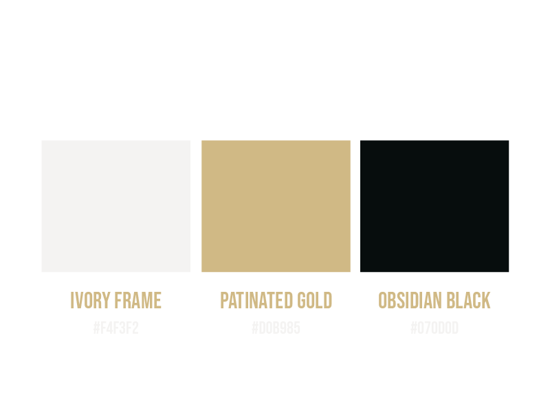
The color palette was developed to support a cinematic, minimalist visual language rooted in contrast, restraint, and materiality.
Rather than relying on decorative or trend-driven tones, it draws from film photography, gallery spaces, and vintage photographic equipment. Each color serves a structural role within the identity — balancing light and shadow, softness and depth, while reinforcing a sense of timelessness and quiet luxury. The palette is intentionally limited, allowing the work to remain the focal point while ensuring longevity across both digital and print applications.
#F4F3F2 — “Ivory Frame”
A soft, warm off-white used as the primary light base. It recalls fine art paper and gallery walls, allowing imagery to breathe while maintaining an editorial calm. It introduces light without sterility, balancing darker elements and reinforcing a sense of refinement.
#D0B985 — “Patinated Gold”
A muted, desaturated gold inspired by aged metal and photographic hardware rather than ornament. It functions as a restrained accent, signaling luxury through subtlety. Its softened tone avoids excess, aligning instead with heritage, craft, and quiet confidence.
#070D0D — “Obsidian Black”
A deep, near-black that anchors the identity in cinematic contrast. It evokes darkroom shadows and film stills, creating depth and atmosphere without harshness. It provides visual weight and authority, allowing typography and imagery to hold presence within a minimal system.
TYPOGRAPHY

The typographic system balances structure and expression, reflecting the dual nature of the brand through architectural precision paired with emotional depth. Rather than relying on decorative type, the selection emphasizes clarity, proportion, and tone — allowing typography to support imagery without competing with it.
Display Typeface: Bebas Neue
A modern grotesque with a strong, architectural presence. Its clean lines and condensed structure create immediate visual impact, making it ideal for headlines and moments that require clarity and authority.
Body Typeface: Zodiak
A refined serif designed for readability and flow. Its elegant proportions and editorial rhythm support longer texts, making it well-suited for case studies, presentations, and digital interfaces.
Accent Typeface: Adorn Script
A delicate script used sparingly for accents and quotes. It introduces a subtle, expressive layer that adds softness and personality, balancing the structure of the system.
Together, this combination establishes a clear and intentional hierarchy — bold where attention is needed, restrained where clarity is essential, and expressive in moments of emphasis — resulting in a typographic voice that feels cinematic, editorial, and timeless.